


When it comes to home decor, the bathroom is often an overlooked sanctuary—an oasis where we begin and end our day. While function reigns supreme in these intimate spaces, the choice of paint color can transform a mundane restroom into a soothing retreat or a vibrant escape. Whether you’re embarking on a full renovation or simply refreshing the walls, selecting the right shade can set the tone for relaxation, energy, or even a little bit of whimsy. In this ultimate guide,we’ll explore the psychology of color,delve into the latest trends,and provide practical tips to help you choose the perfect paint palette for yoru bathroom.Get ready to unleash your creativity and discover how the right hues can breathe new life into your space, making it both stylish and uniquely yours.
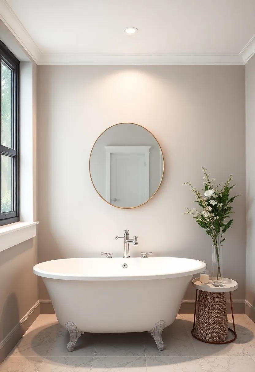
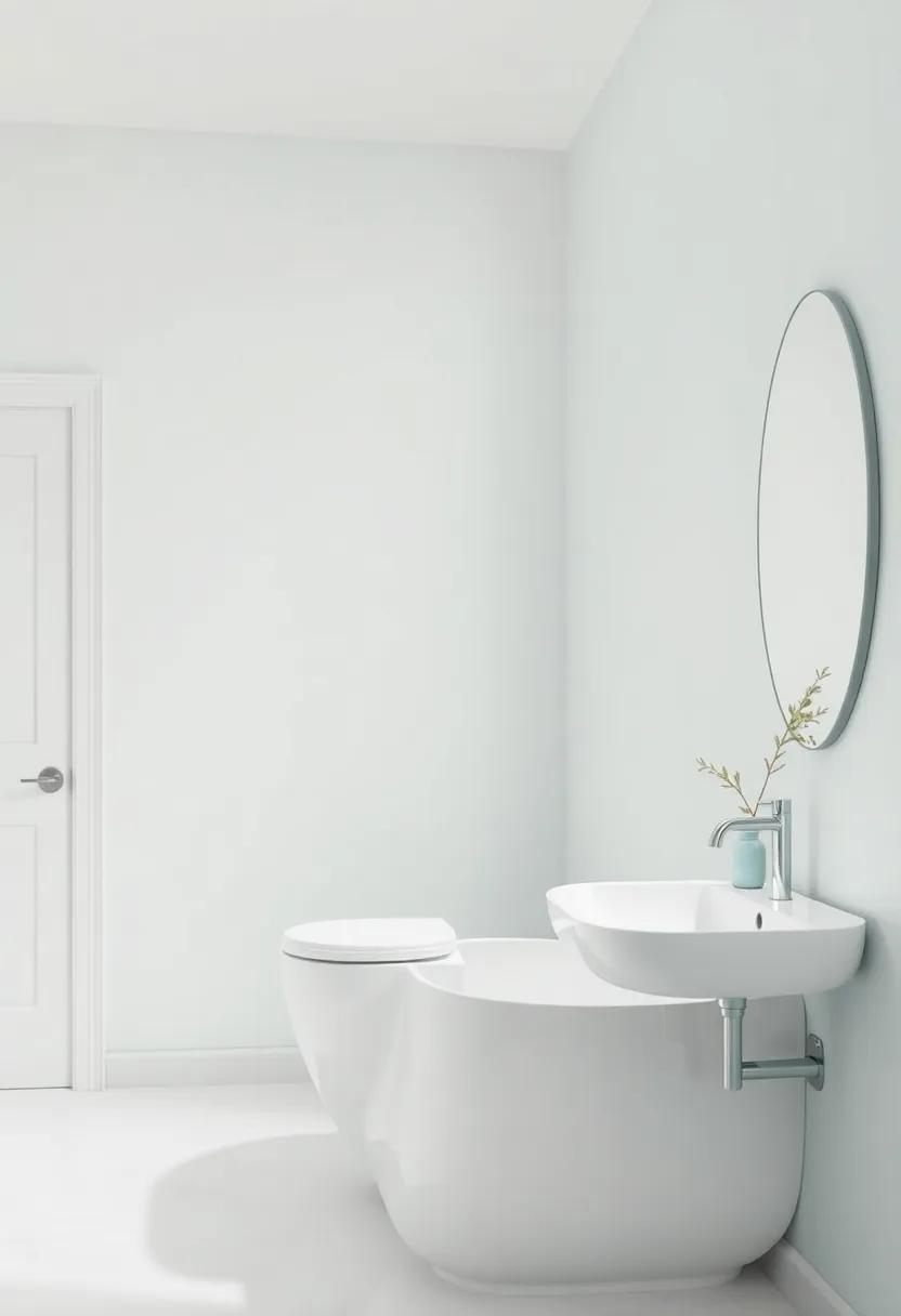
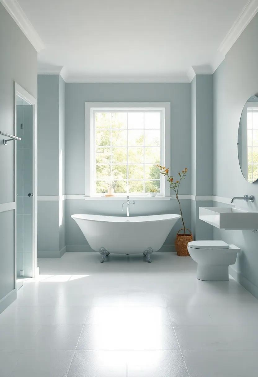
Transforming Small Spaces with Light Shades for an Airy Feel
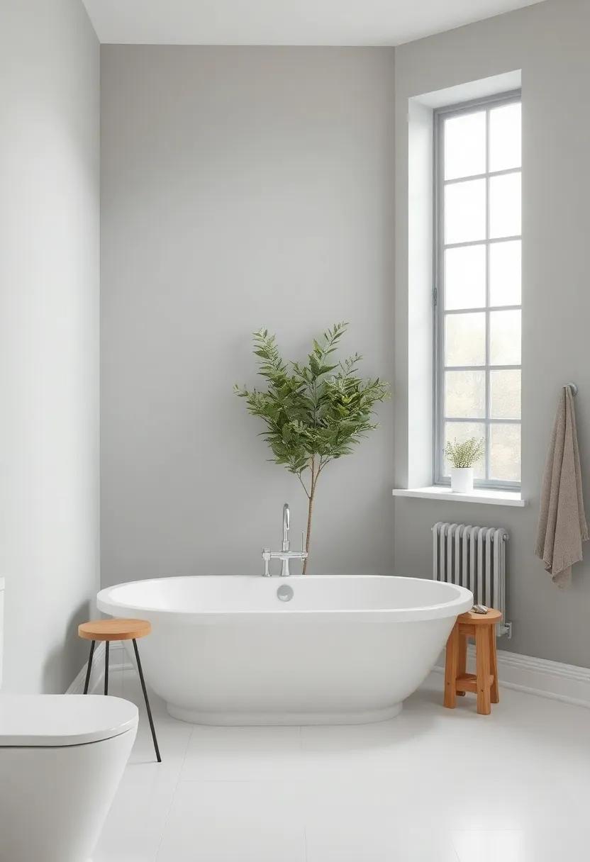
When it comes to making a small bathroom feel expansive,the right choice of light shades can work wonders. Opt for soft pastels or whites with subtle undertones to enhance the sense of space. These colors not only reflect light but also create a tranquil atmosphere that can transform even the coziest of corners. Consider using combinations of these hues on the walls and ceiling to create a seamless look, which helps to blur the boundaries of the room.
To maximize the airy feel, complement your chosen paint shades with fixtures and accessories that embody the same lightness. Incorporate elements such as:
- Mirrors: Strategically place mirrors to reflect light and enlarge the sense of space.
- Glass Accents: Use glass shower doors or shelves to maintain an unobstructed view.
- Natural Elements: Bring in plants for a touch of nature that adds color and freshness without overwhelming the space.
By thoughtfully combining color and decor, you can create a bathroom that feels both inviting and spacious, effectively utilizing the power of light shades to elevate your small space.
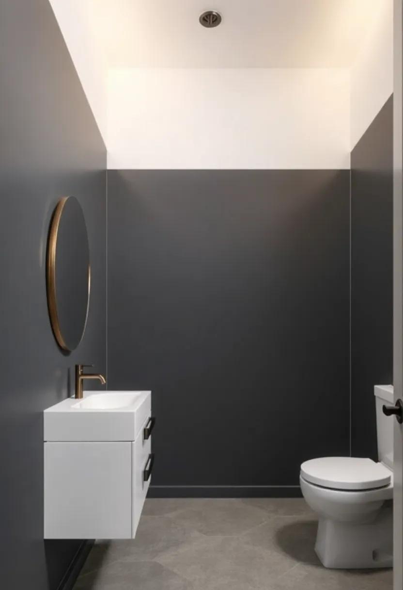
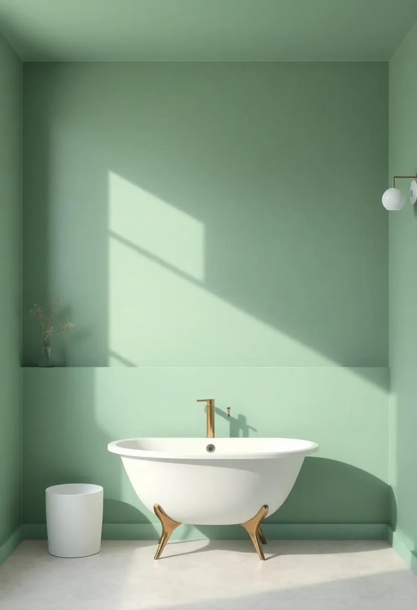
The Bold Statement: Embracing Dark Hues in Bathroom Design
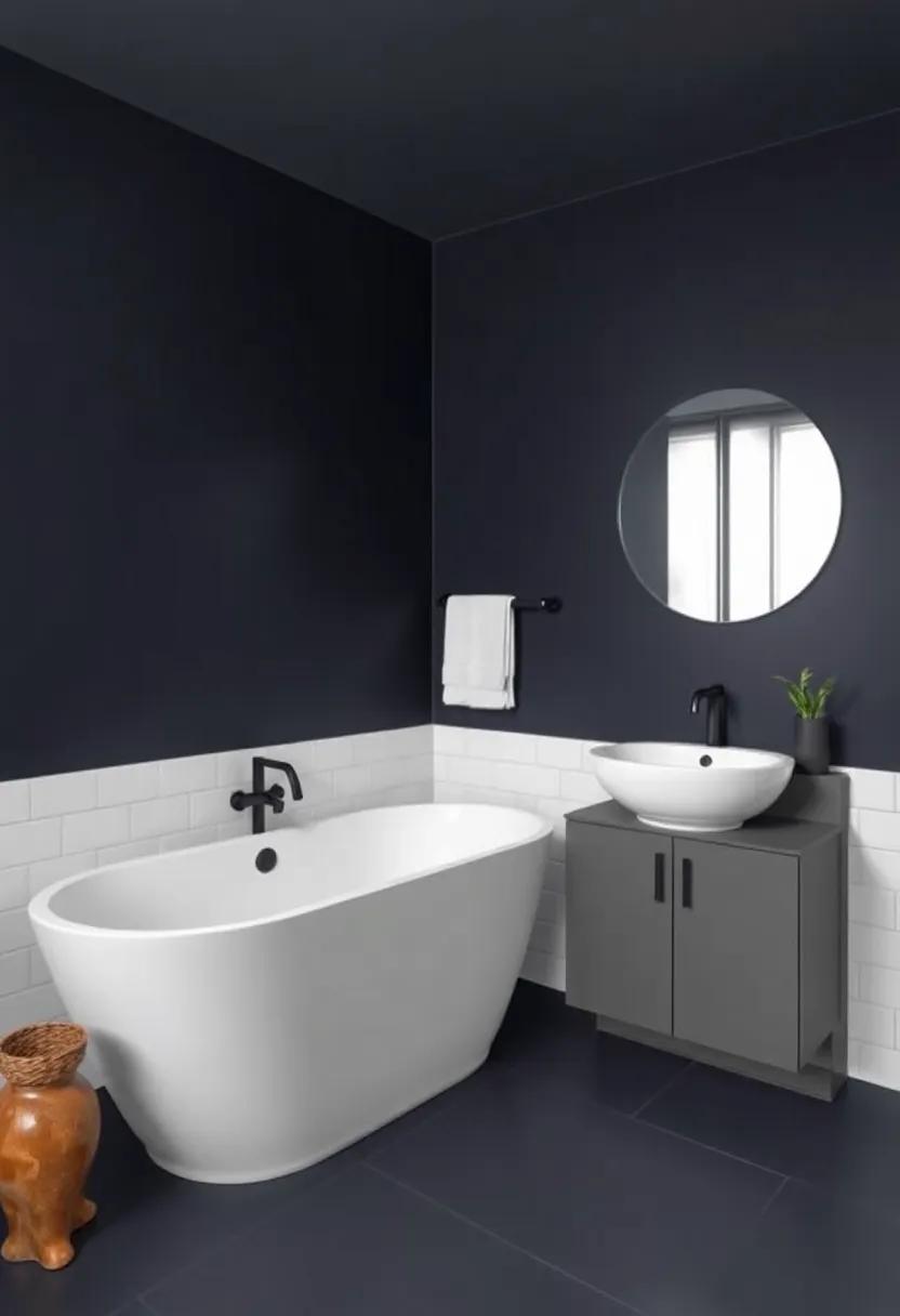
When thinking of bathroom aesthetics, many envision light, airy colors to create a sense of space. However, embracing dark hues can infuse your bathroom with a sophisticated elegance that is both bold and refreshing. Deep greens, charcoal grays, and rich navy can transform ordinary walls into a striking backdrop where elegance reigns supreme. To amplify the allure of darker colors, consider pairing them with metallic accents or crisp white fixtures. These contrasts not only highlight the darkness but also create a balanced visual appeal that is anything but oppressive.
Moreover, the careful selection of textures and lighting plays a crucial role in the triumphant implementation of dark shades. Consider incorporating elements such as:
- Matte finishes that soften the depth of dark colors.
- Mirrored surfaces to reflect light and create intrigue.
- Natural materials like wood or stone to introduce warmth and balance.
Utilizing various lighting options, such as wall sconces or ambient fixtures, can definitely help to soften the impact of the darker tones while enhancing their depth. This nuanced approach to design ensures that the bathroom remains a calm oasis rather than a cave-like space, inviting relaxation and rejuvenation.
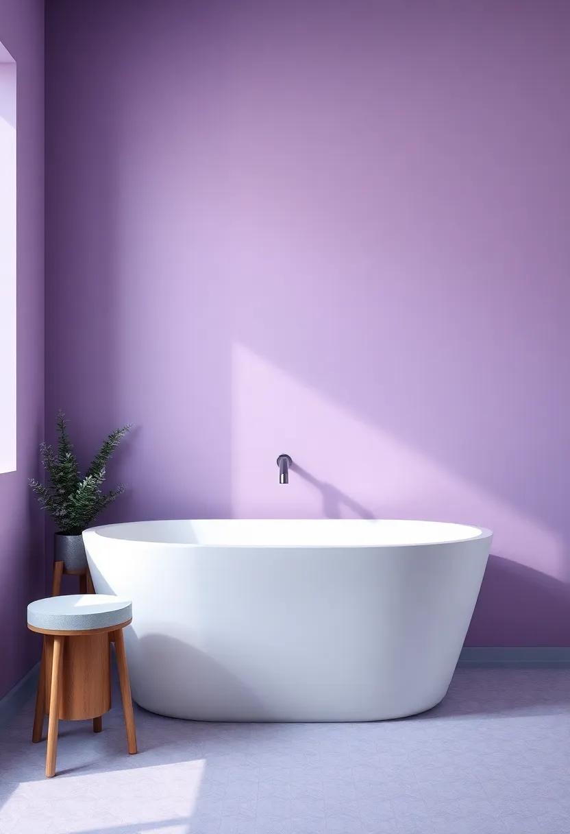
Finding Serenity: Soft Pastels That Bring Calm to Your retreat
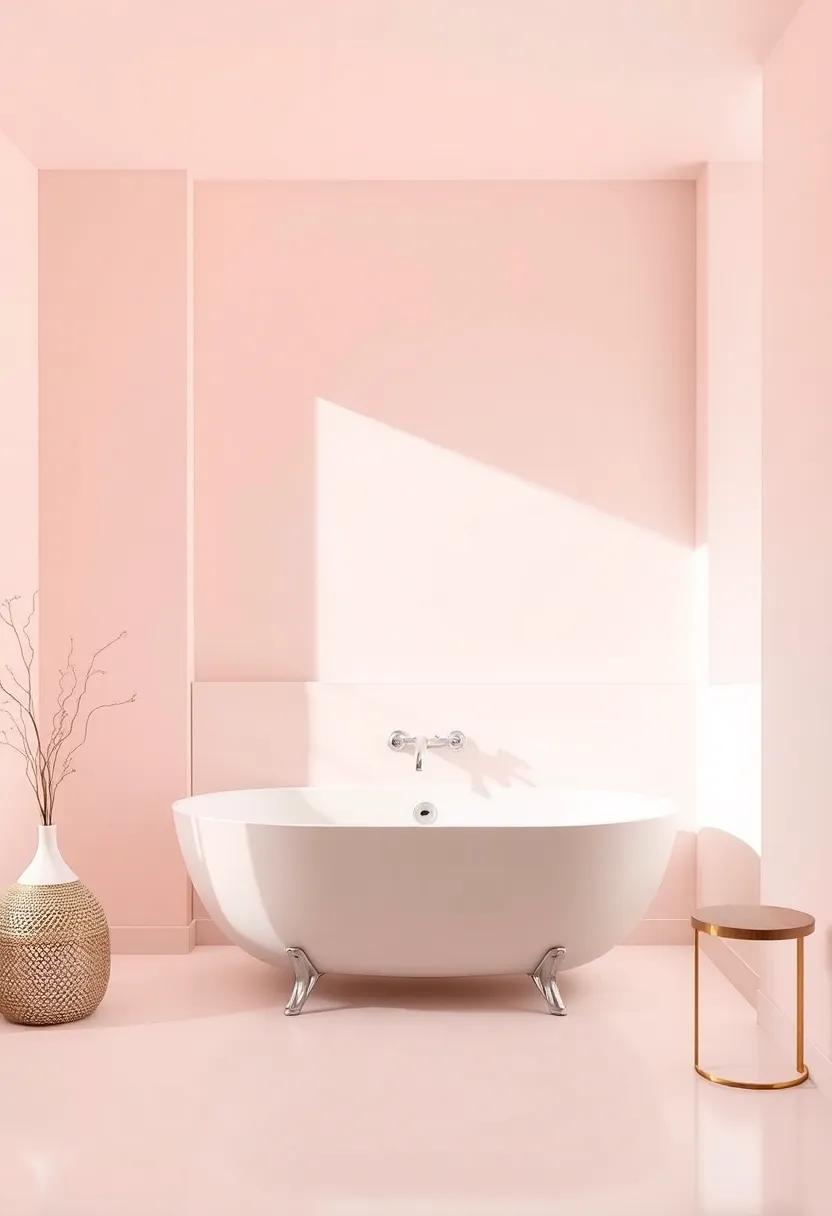
Soft pastels have a remarkable ability to create a tranquil atmosphere in any space,making them an ideal choice for a bathroom retreat. Colors such as powder blue, pale lavender, and mint green offer a gentle touch that encourages relaxation.These shades evoke a sense of serenity, reminiscent of coastal breezes and blooming gardens. When selecting your bathroom paint, consider the following elements:
- Lighting: Natural light can enhance pastel hues, making your bathroom feel airy and open.
- Fixtures: Coordinate with existing fixtures—soft colors often complement whites, metals, and natural materials.
- Accent colors: Pair pastels with deeper shades for a balanced, harmonious look.
creating a soothing retreat isn’t just about the paint color; it’s also about how each choice works together. To further enhance your calming space,consider incorporating complementary accessories and textures. Below is a suggested combination to inspire your design:
| Color | Mood |
|---|---|
| Powder Blue | Relaxing & Refreshing |
| Pale Lavender | Calming & Serene |
| Mint Green | Invigorating & Rejuvenating |
| Soft Peach | Warm & Cozy |
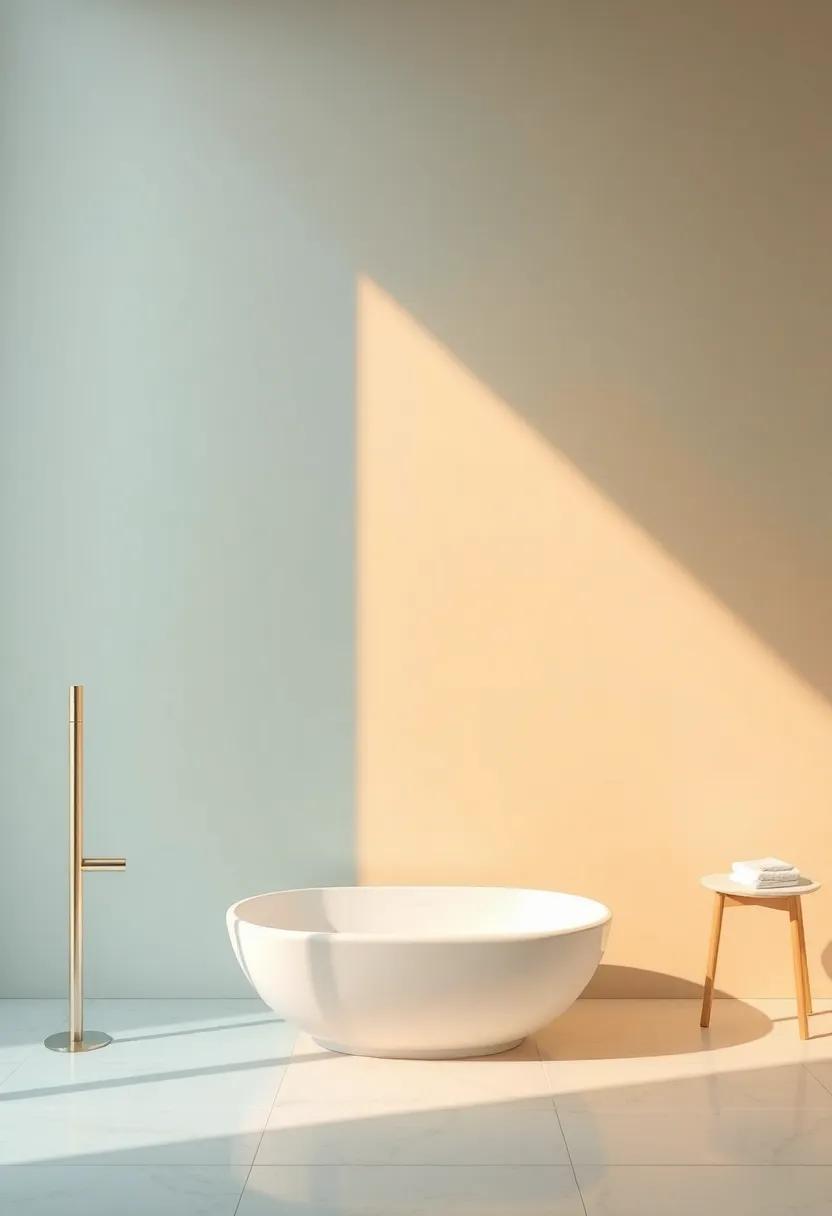
The Impact of Glossy Finishes: Reflecting Light in Stylish Ways
Glossy finishes bring an extraordinary dimension to your bathroom walls by transforming the way light interacts with color. Unlike matte finishes, these reflective surfaces can amplify natural and artificial lighting, creating an illusion of spaciousness that is notably beneficial in smaller bathrooms. When light bounces off a glossy surface, it not only brightens the space but also highlights architectural details, making them stand out. Consider pairing a light blue or soft green glossy paint with white trim to evoke a serene spa-like atmosphere, or use bold tones like deep navy to create drama and sophistication.
Choosing the right glossy paint can be pivotal in dictating your bathroom’s vibe. Here are a few materials and their aesthetic effects:
| Material | Effect |
|---|---|
| High-Gloss | Super reflective; dramatic and chic |
| Satin | Soft sheen; elegant and inviting |
| Eggshell | Low sheen; retains warmth while adding depth |
When selecting glossy finishes, always test samples in various lighting conditions to appreciate how the finish interacts with your chosen color palette. Opt for durability and easy cleaning as key factors, especially in moisture-prone areas. Ultimately, the right glossy finish can elevate not only the aesthetic appeal but also the functionality of your bathroom, making it a truly stylish retreat.
Choosing Timeless Neutrals: A Classic Foundation for Your Bathroom
When it comes to designing a bathroom that feels both sophisticated and soothing, embracing a palette of timeless neutrals can lay the perfect groundwork. Shades such as warm taupe, soft beige, and cool greys won’t just elevate the aesthetic; they create a seamless backdrop that harmonizes with a variety of decor styles. By focusing on these classic tones, you open up a world of possibilities for incorporating vibrant accents thru linens, towels, or decorative elements without overwhelming the senses. This approach allows the bathroom to age gracefully, remaining stylish through trends while retaining a sense of comfort.
To achieve an inviting atmosphere, consider the following options for your neutral palette:
- Warm Whites: A crisp, clean white can expand the space visually while promoting a fresh feeling.
- Sandy Beiges: Soft, sandy hues bring warmth and a touch of earthiness, ideal for a calming retreat.
- Classic Greys: A mid-range grey can offer sophistication and elegance without feeling cold, especially when paired with rich wood or metallic accents.
Incorporating these colors in your paint choices not only enhances the overall lighting but also creates a tranquil sanctuary perfect for relaxation. To further aid in your decision-making, consider the following table that showcases the benefits of each neutral shade:
| Color | Benefits |
|---|---|
| Warm White | Brightens space, enhances openness. |
| Sandy Beige | Functions well with natural light, adds warmth. |
| Classic Grey | Timeless sophistication, pairs well with various materials. |
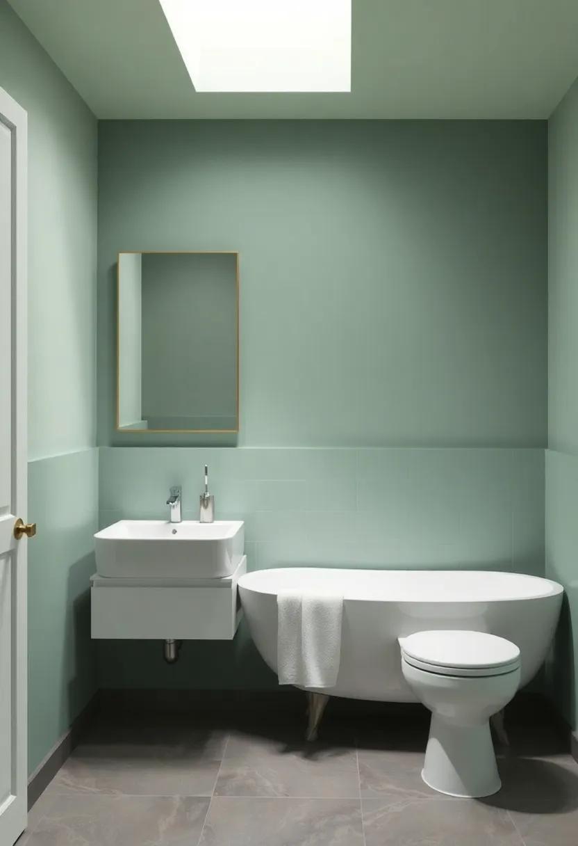
Nature-Inspired Palettes: Earthy Tones That Invite the outdoors In
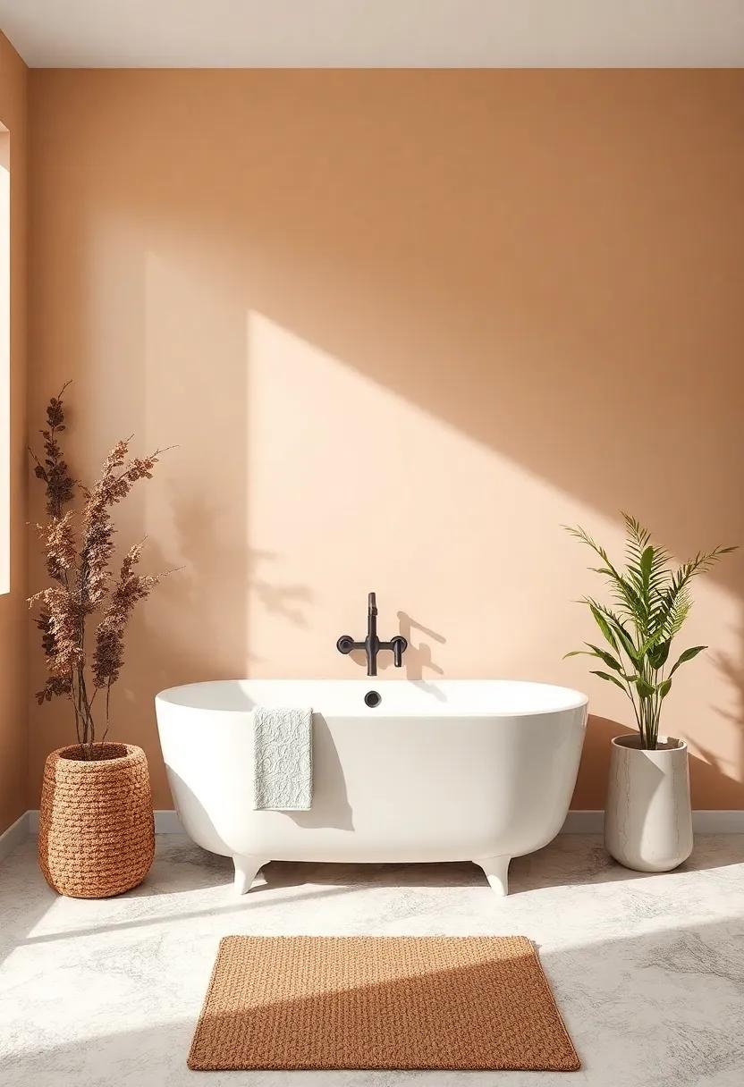
Embracing the soft, warm shades of nature can breathe life into your bathroom, making it a serene sanctuary. Consider hues like sage green, soft beige, or terracotta, which draw inspiration from the earth and sky. These colors not only promote a sense of calm but also create a beautiful backdrop for natural materials like wood and stone, enhancing the organic feel of your space. Layering these shades can bring depth and richness, turning your bathroom into a tranquil escape that invites the outdoors in.
To further enhance this connection with nature, you can incorporate various textures and finishes. Picture a matte beige wall paired with glossy teal tiles or a rustic wooden vanity set against a backdrop of warm taupe. Here are some complementary ideas to explore:
- Olive Green – evokes a sense of peace.
- Dusty Rose – adds a soft, romantic touch.
- Burnt Umber – brings warmth and earthiness.
- Sky Blue – to reflect openness and tranquility.
| Color idea | Emotional Impact |
|---|---|
| Warm Beige | Cozy and Inviting |
| Soft Sage | Relaxing and Restorative |
| Terracotta | Warmth and Stability |
| Cool Gray | Calm and Tranquil |
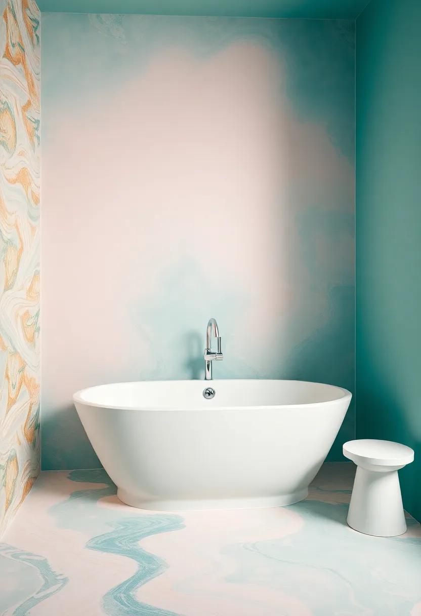
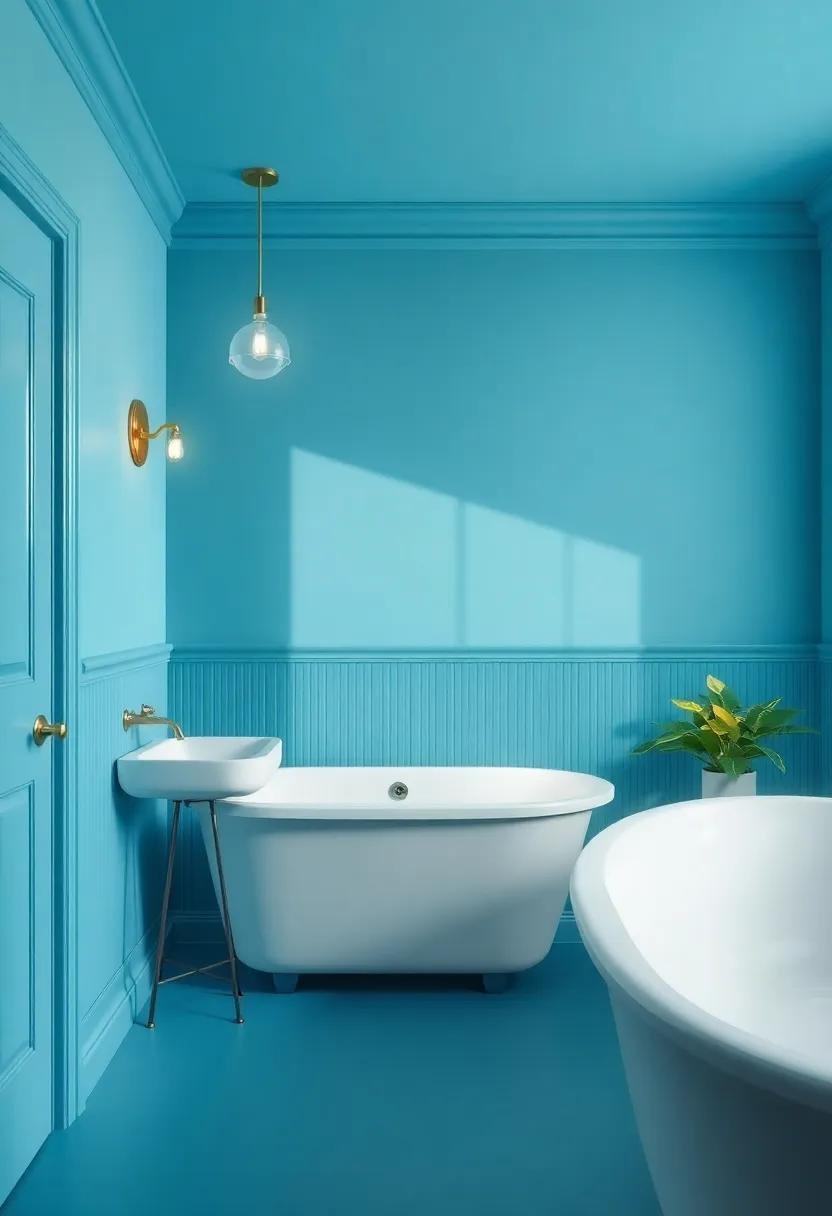
Creating a Spa-Like Experience with Tranquil Colors
To create a spa-like atmosphere in your bathroom, the choice of paint colors is instrumental. Opt for tranquil shades that evoke peace and serenity. Soft blues and greens can help mimic the calming essence of nature, while muted grays and soft whites can amplify the light and spaciousness of your environment. Consider layering these colors with varying intensities to create depth; as an example, a pale blue on the walls complemented by darker accents can enhance the feeling of calm. Adding a gloss finish on trim and moldings can provide a subtle shine that reflects light beautifully, maximizing the overall ambiance.
When selecting your palette, it’s beneficial to think about how different hues resonate with your senses. Use a color wheel to help visualize complementary combinations.Consider the following serene color pairings to inspire your choices:
| Base Color | Complementary accent |
|---|---|
| Soft Aqua | Warm Beige |
| Gentle lavender | Cool Gray |
| Pale Sage | White Sand |
| Light peach | Dusty Rose |
Incorporating natural elements alongside your paint choices can further enhance the calming effect. Consider adding potted plants or wooden accessories that resonate with your color scheme. This thoughtful integration not only solidifies your color story but also promotes a refreshing balance between color and nature within your tranquil retreat.
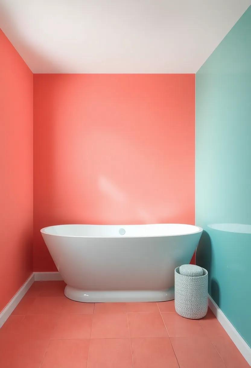
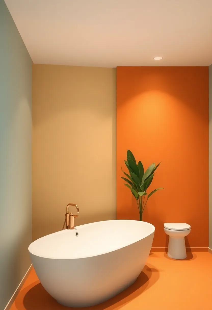
Dramatic Accents: Using Accent Walls to Elevate Your Space
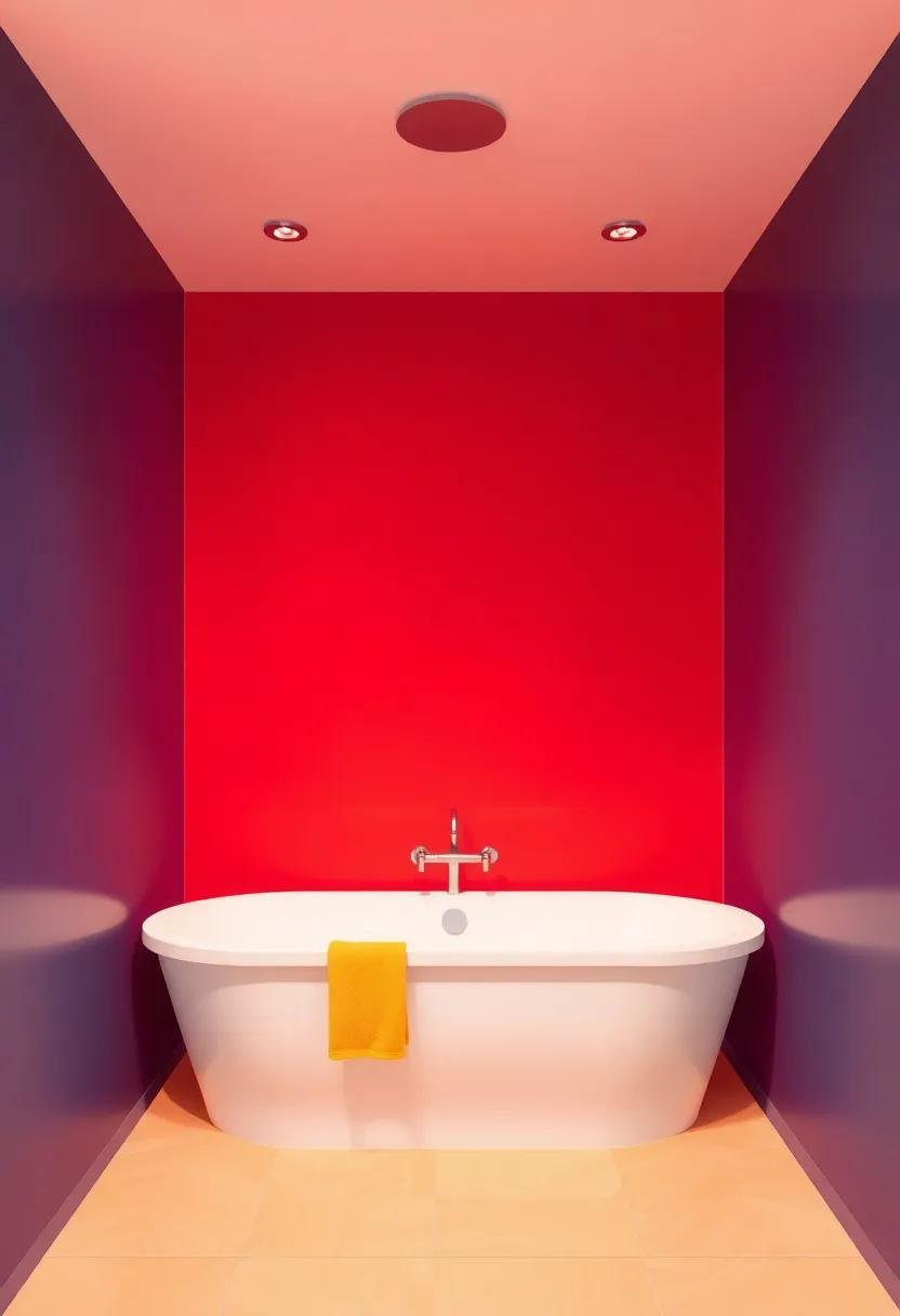
Transforming a mundane bathroom into a stunning oasis is all about finding that standout feature, and an accent wall can serve as the perfect focal point. By selecting a bold color or unique texture for one wall, you create a striking contrast that breathes life into the space. Consider using materials like textured tiles or peel-and-stick vinyl that evoke a sense of luxury and individuality. When choosing a color,think deep blues,lush greens,or vibrant corals that set an inviting mood while complementing your fixtures.
To effectively implement an accent wall, keep in mind the following tips for a harmonious design:
- Choose a wall that draws the eye – typically the wall behind the vanity or tub.
- Balance your selection with lighter tones on the other walls for an airy feel.
- Incorporate decor that ties the accent color into the rest of your bathroom, such as towels or artwork.
Below is a simple table to help you visualize different accent wall options and accompanying colors for a cohesive look:
| Accent Wall Color | Complementary Colors | Suggested Materials |
|---|---|---|
| Deep Teal | White, Gray | Paint, Wood Paneling |
| Burnt Orange | Soft Beige, Cream | Tiles, Wallpaper |
| Charcoal Gray | Pale mint, Rose | Paint, Stone |
Seasonal inspiration: Colors That Adapt with the Changing Seasons
As the seasons shift, so too can the mood of your bathroom through carefully selected paint colors.Spring often beckons soft pastels, like pale lavender or mint green, invoking a sense of renewal and freshness. These hues not only expand the room visually but create an inviting space where you can unwind.As we transition into Summer, bright colors such as coral or sunny yellow can infuse energy and vibrancy, enhancing the light and warmth that this season brings. Consider using these vivid shades in accent areas or as a base for playful decor.
with the arrival of Autumn, rich tones like burnt orange, deep aubergine, or olive green evoke coziness, perfect for a bath that feels like a serene retreat. To embrace the chill of Winter, deeper shades such as navy blue or charcoal gray can provide a sophisticated backdrop, harmonizing beautifully with metallic accents for a touch of luxury. To further guide your selection, refer to the table below highlighting seasonal palette ideas to inspire your paint choices:
| Season | Colors | Vibe |
|---|---|---|
| Spring | Pale Lavender, Mint Green, Sky Blue | Fresh & Inviting |
| Summer | Coral, Sunny Yellow, Aqua | Bright & Energetic |
| Autumn | Burt Orange, Deep Aubergine, Olive Green | Cozy & Warm |
| Winter | Navy Blue, charcoal Gray, Deep Teal | Sophisticated & Calm |
Mixing Patterns and Colors: Balancing Boldness with Subtlety
When it comes to designing your bathroom, striking the perfect balance between boldness and subtlety with patterns and colors can create a visually harmonious space. One effective way to achieve this balance is to mix bold patterns,such as geometric tiles or floral wallpapers,with more muted color palettes. Consider pairing a vibrant shower curtain with soft, neutral paint to draw attention to the patterns without overwhelming the senses. This approach allows you to embrace creativity while still maintaining a sense of tranquility.
To ensure that your selections complement rather than clash, focus on a cohesive color scheme.Here’s a simple guide to follow:
| Color | effect |
| Muted Neutrals | Grounding |
| Bold Accent colors | Invigorating |
| Delicate Patterns | Soothing |
| Contrasting Stripes | Dynamic |
By incorporating a mix of these elements, you can create visual intrigue that feels both inviting and energizing, allowing you to curate an oasis that reflects your personal style while remaining functional and stylish.
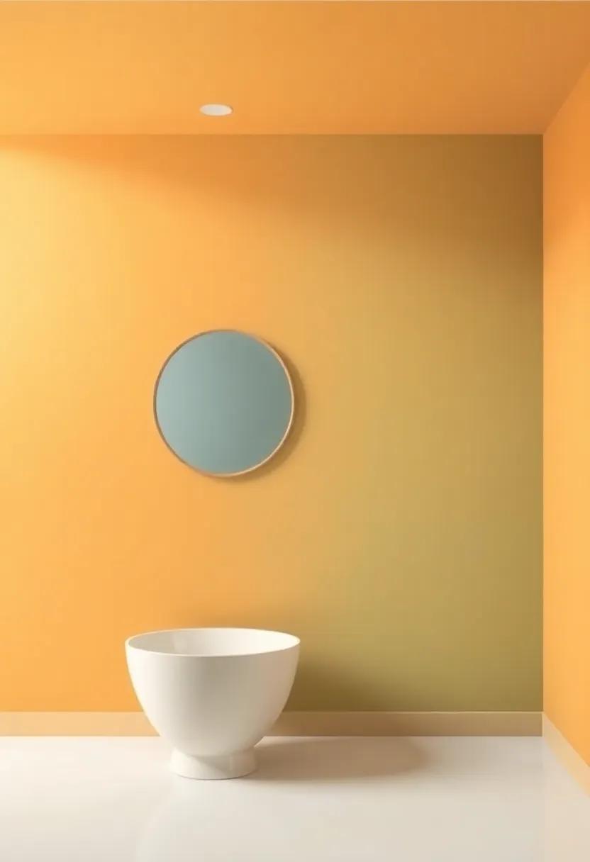
The Psychology of Color: Understanding Its Mood-Altering Effects
Color is more than just a visual experience; it’s a powerful psychological tool that can substantially influence our emotions and mood. In the realm of interior design, particularly in spaces like bathrooms, understanding the mood-altering effects of color is essential.For instance, hues such as soft blues and greens evoke feelings of tranquility and relaxation, making them perfect for creating a serene bathing environment.On the other hand, vibrant colors like yellows or oranges can energize the space, filling it with warmth and vitality, ideal for those mornings when you need a boost to start the day.
when selecting a color palette, it’s crucial to consider the ambiance you want to cultivate. here are a few key psychological associations of popular bathroom colors to ponder:
- White: Purity and cleanliness
- Gray: Sophistication and calmness
- Pale Blue: Serenity and peace
- Soft Green: Rejuvenation and freshness
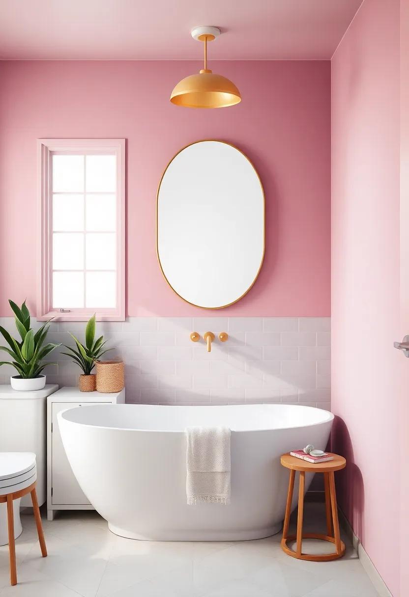
- Pastel Pink: Comfort and warmth
You can also incorporate color trends that resonate with your personal style while maintaining the psychological benefits you seek. To assist in your decision-making, take a look at the following table that summarizes different colors along with their mood-enhancing effects:
| Color | Mood Effect |
|---|---|
| Blue | Calming, promotes relaxation |
| Yellow | Cheerful, invigorating |
| Green | Refreshing, restorative |
| Purple | Lavish, stimulates creativity |
Choosing Eco-Friendly Paints for a Healthier Bathroom Environment
When selecting paints for your bathroom, prioritize eco-friendly options that promote a healthier indoor atmosphere. Low-VOC (volatile organic compounds) paints are an excellent choice as they release fewer harmful chemicals into the air. These environmentally conscious paints not only contribute to better air quality but also reduce the risk of respiratory issues or allergic reactions. Additionally, look for products that are labeled as non-toxic, biodegradable, or water-based, as these options minimize environmental impact and are safer for you and your family.
To further enhance your bathroom’s eco-friendliness, consider the following points when picking the right paint:
- Color Selection: Lighter shades can help create an illusion of space and tranquility.
- Finish Type: Opt for a satin or semi-gloss finish, which offers better moisture resistance, making it ideal for humid environments.
- Manufacturer Certification: Choose brands that adhere to environmental standards, ensuring transparency in their production processes.
Color Trends That Elevate Bathroom Aesthetics in modern Design
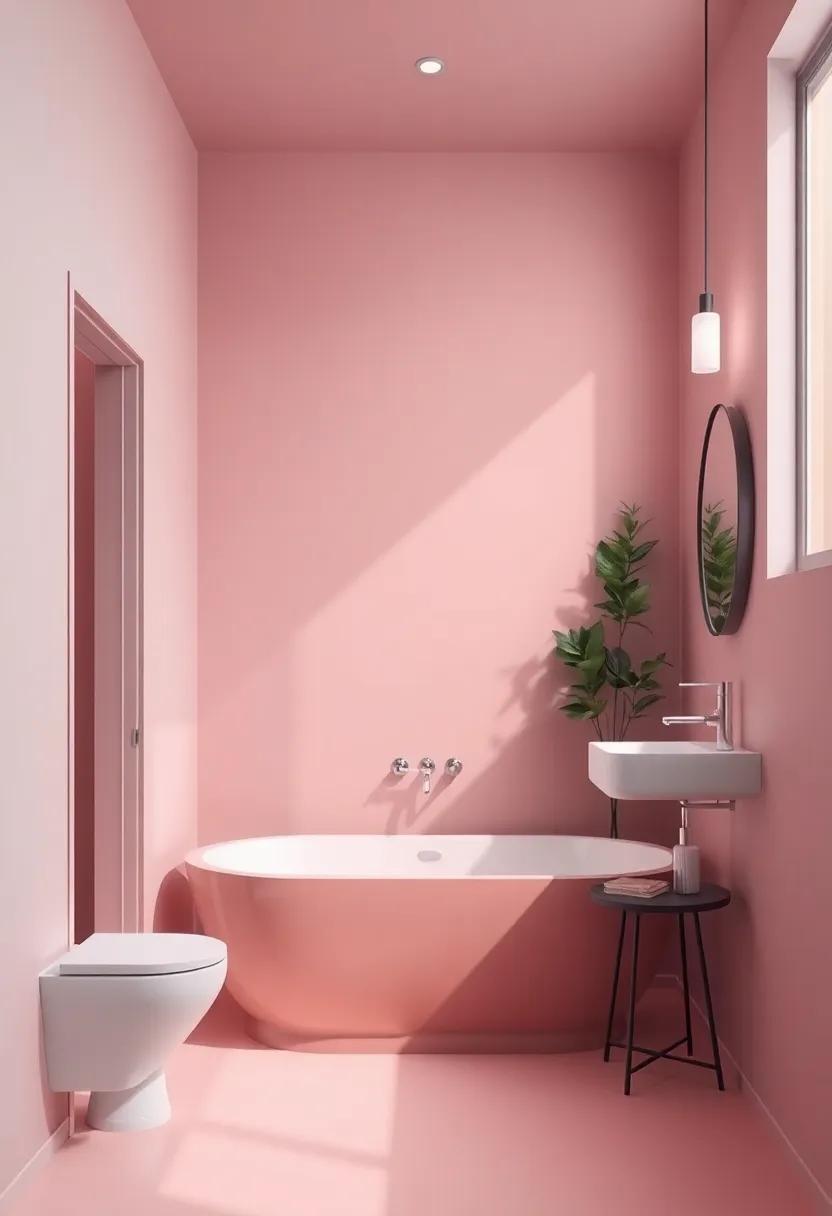
In the realm of modern design, the color palette of your bathroom is not just about aesthetics but also an essential element that influences the mood and functionality of the space.Soft pastels such as muted greens and blush pinks are incredibly popular as they evoke a sense of tranquility, perfect for a relaxing soak after a long day.These hues can be beautifully complemented by natural wood accents or sleek metallic fixtures, creating a harmonious balance between warmth and sophistication. Alternatively, the use of deeper tones like rich navy or charcoal can add an element of drama, making the bathroom feel like a luxurious retreat. Pairing these shades with crisp white accents can help lighten the space and maintain a clean, contemporary feel.
Another trend gaining traction is the bold use of vibrant hues that make a statement. Teal, mustard yellow, or emerald green can transform a mundane washroom into an eye-catching oasis, particularly when used as accent walls or cabinetry. Matching these vibrant colors with clever lighting solutions can create dynamic visual interest, drawing attention to your choices. Don’t shy away from textured finishes either—painting with finishes that reflect light differently can add depth to the colors you select.To help you navigate these options, here’s a simple table outlining current trending colors alongside their suggested complementary tones:
| Trending Color | Complementary Shades |
|---|---|
| Soft Blush | White, Gold accents |
| Muted Sage | Natural Wood, Cream |
| Rich Charcoal | Bright White, Silver Hardware |
| Teal | Coral, Light Gray |
| Mustard Yellow | Pale Blue, Dark Brown |
Layering Shades for Depth: The Art of Color Gradation
Exploring the nuances of color gradation can breathe life into your bathroom, providing a textural canvas that draws the eye. When layering shades, consider beginning with a base coat in a soft hue, such as pale aqua or gentle lavender. from there, introduce deeper tones through strategic accents, like teal or plum, to create visual interest. Here are some tips to inspire your layering journey:
- Start with light-to-dark transitions for an airy feel.
- Incorporate contrasting shades to highlight architectural features.
- Use matte and glossy finishes to enhance depth.
To effectively apply this technique, consider using a color wheel as your guide. A harmonious palette can be achieved by selecting colors that complement each other, creating a serene environment. To illustrate this concept, the following table presents three color schemes for layering, each evoking a distinct mood:
| Color Scheme | Base Color | accent Color | Mood |
|---|---|---|---|
| Coastal Calm | Pale Aqua | Deep Teal | Relaxed and refreshing |
| Elegant Retreat | Soft Lavender | Rich Plum | Luxurious and soothing |
| Earthy Oasis | Muted Sage | Burnt Umber | Grounding and natural |
Expressing Personal Style Through Unique Color Combinations
When it comes to personalizing your bathroom, the interplay of colors can be a powerful expression of your individuality. Selecting unique color combinations not only enhances the aesthetic appeal but also reflects your personal taste. Consider pairing soft pastels like mint green with crisp whites for a fresh, airy feel, or opt for a bolder pairing of navy blue and mustard yellow to create a striking contrast. Experimenting with unexpected hues can elevate your space from ordinary to extraordinary, making the bathroom a true reflection of who you are.
To make your color selection more impactful,think about the mood you want to create. For instance, combinations such as lavender and sage create a serene and calming environment, ideal for a relaxing soak. Meanwhile, colors like charcoal grey and blush pink bring a modern touch, effortlessly blending sophistication with warmth. Here’s a quick reference table to inspire your color journey:
| color Pairing | Mood Created |
|---|---|
| Mint Green & Crisp White | Fresh and Airy |
| Navy Blue & mustard Yellow | Bold and Energizing |
| Lavender & Sage | Serene and Relaxing |
| Charcoal Grey & Blush Pink | Modern and Warm |
Integrating Fixtures and Finishes: harmonizing Colors Throughout
When embarking on a bathroom renovation, one of the most pivotal aspects to consider is the synergy between fixtures—such as sinks, faucets, and bathtubs—and the finishes you choose for your walls and cabinetry. A cohesive color palette can transform your space into a sanctuary of relaxation. Start by identifying a primary color that resonates with your vision. This could be a soft, soothing hue like pale blue or a bold statement like deep navy. From there,curate an assortment of complementary shades for your fixtures. Consider the following combinations:
- Light Gray Walls with brushed Nickel Fixtures
- Soft Sage Green with Polished Gold Accents
- classic White with Matte Black Finishes
Once you’ve established your main colors, focus on the scale of the elements in the bathroom.Larger fixtures contribute significantly to the overall look, while the finishes can subtly tie the entire aesthetic together.To fully realize your vision, consider using a style guide that details the hues, textures, and materials chosen. This can serve as a handy reference during your selection process. Below is an example of a simple color coordination table:
| Fixture Type | Wall Color | Finish Color |
|---|---|---|
| Sink | Pale Blue | Polished Chrome |
| bathtub | Soft Beige | Brushed Bronze |
| Faucet | Warm Taupe | Matte Black |
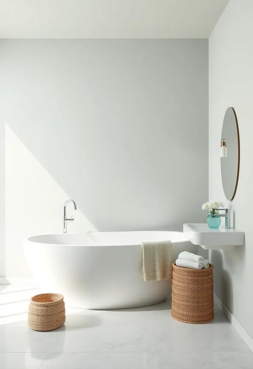
Inviting Natural Light: Selecting colors That Enhance Brightness
To create a bright and airy bathroom, the choice of color plays a pivotal role. Selecting the right hues can amplify any natural light that flows into the space. Consider pale shades like soft blues, greens, or warm whites that reflect light beautifully and contribute to an open feel. These tones not only enhance brightness but also evoke a serene atmosphere that can be both calming and rejuvenating. Additionally, using metallic accents such as gold or silver in fixtures can further catch and reflect light, elevating the overall brightness of the room.
Incorporating lighter shades in combination with strategic design elements can significantly transform your bathroom ambiance. Here are some tips to maximize the effect:
- Ceiling Colors: A bright white or a very light color can create an illusion of height and spaciousness.
- Accent Walls: A single wall painted in a slightly darker pastel can add depth while maintaining brightness.
- Textured Finishes: Matte finishes tend to absorb light,while glossy paints reflect it,so use gloss on areas where you want to enhance illumination.
| Color | Effect |
|---|---|
| Soft Blue | Invokes tranquility and expands space visually |
| Pale Green | Brings a refreshing and natural feel |
| Warm White | Maximizes brightness and enhances cleanliness |
Pairing Color with Texture: The Role of Surface Design in Bathrooms
When it comes to bathroom design, the interplay between color and texture can dramatically transform the overall aesthetic of the space. Selecting the right paint color is just one part of the equation; the texture of surfaces can either enhance or clash with those colors. For instance, glossy tiles paired with soft matte paint create a sophisticated contrast that brightens the space. Alternatively, a slate finish combined with warm beige walls can evoke a sense of calm and serenity. Consider the following combinations to elevate your bathroom design:
- Light Blue - Complements Wood Grain for a tranquil nautical vibe.
- Soft Gray – Pairs beautifully with Textured Stone for an elegant, modern look.
- Muted Green – Goes well with Woven Textiles for a spa-like environment.
Incorporating varied textures can also guide the color choices you make. Surfaces that are glossy, like glass or polished tiles, frequently enough reflect light, making lighter shades appear airy and spacious.In contrast, rough textures, such as exposed brick or matte finishes, can anchor bold colors, providing warmth and depth. To help visualize these effects, refer to the table below that outlines color and texture pairings that inspire creativity:
| Color | Texture | Effect |
|---|---|---|
| Coral | Faux Stone | Warm & Inviting |
| Classic white | matte Finish | Clean & Timeless |
| Deep Navy | Honed Marble | Luxurious & Bold |
Cultural Influences on Bathroom Color Choice Around the World
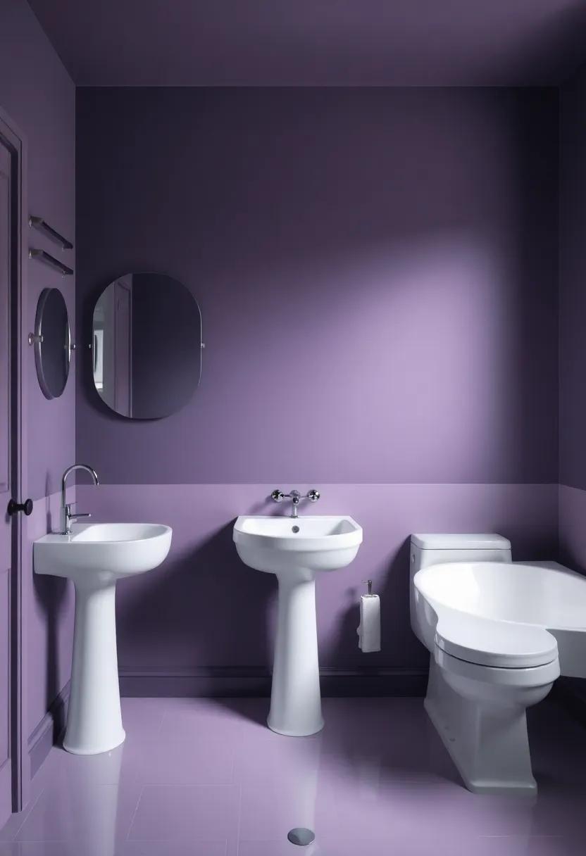
Cultural influences profoundly shape our perception of color and its emotional resonance in interior spaces, particularly in places of personal retreat like bathrooms.In various regions, color choices reflect historical contexts, local materials, and the symbolism associated with colors. For instance, in Mediterranean cultures, vibrant blues and whites evoke the colors of the sea and sky, promoting a sense of serenity and cleanliness. Conversely, in Scandinavian design, soft pastels and neutrals dominate, creating a feeling of spaciousness and tranquility that echoes the region’s natural landscapes.
Moreover,the meaning of particular colors can vary dramatically across cultures. While bright reds may symbolize joy and good fortune in some Asian cultures, they could be seen as overwhelming or aggressive in others. Bathrooms in less traditional designs within Western cultures might favor darker tones like charcoal or navy, projecting a sense of luxury and sophistication. Understanding these nuances can empower homeowners to select colors that not only enhance their bathroom’s aesthetic but also resonate with their cultural identity.
Creating Cohesive Spaces: Connecting Your bathroom Color to Your home
When designing a bathroom,it’s essential to think about how its color palette will interact with the rest of your home. A cohesive color story is crucial for creating a unified feel throughout your spaces. To seamlessly integrate your bathroom into the overall aesthetic, consider these aspects:
- Consistency in Color Families: Choose shades that belong to the same color family as your surrounding rooms. For example,if your living area features oceanic blues,soft aqua tones in the bathroom can echo that theme.
- accent Colors: Utilize similar accent colors that pop in adjacent rooms, like vibrant towels or decorative pieces that reflect hues from your other spaces.
- texture and Finish: Consider how different finishes (matte vs. glossy) in your chosen colors can complement other textures in your home.
Creating a balance between your bathroom and other rooms can enrich your living environment. Assessing the size and lighting of your bathroom is vital—darker shades can work well in larger spaces, while lighter tones can make smaller bathrooms feel bigger.Here’s a simple guide to help you visualize potential combinations:
| Room type | Suggested Bathroom Colors |
|---|---|
| Modern Living Room | Soft Greys and White |
| Cozy Bedroom | Pale Blues and Creams |
| Bright Kitchen | Mint Green or light Yellow |
Color Inspirations from Nature: Bringing the Outdoors Inside
When seeking inspiration for your bathroom color palette, look no further than the vibrant hues found in the natural world. From the delicate blues of a serene ocean to the earthy tones of a forest floor, nature offers a breathtaking array of colors that can transform your space into a tranquil retreat. Consider incorporating shades like soft sage greens, reminiscent of lush gardens, or warm terracotta, evoking the sun-kissed clay underfoot. By selecting colors inspired by nature, you can create a calming atmosphere that promotes relaxation and rejuvenation.
To further enhance your design vision, think about pairing these nature-inspired colors with complementary accents. Here are a few combinations to consider:
- Ocean Blue: Pairs beautifully with crisp white fixtures for a refreshing coastal vibe.
- Forest Green: Complements natural wood finishes, creating a warm and inviting sanctuary.
- Soft Sand: Works harmoniously with taupe and beige elements for an earthy, grounded feel.
- Sunset Orange: Injects a pop of energy alongside muted grays for a modern twist.
| Natural Element | Color Inspiration |
|---|---|
| Ocean | Soft Aqua |
| Forest | Deep Pine |
| Desert | Warm Sand |
| Sky | Soft Blue |
Classic versus Contemporary: Aligning Color Choices with Design Styles
When it comes to designing a bathroom, the interplay between color choices and design styles can significantly influence the overall ambiance of the space. Classic styles often favor timeless hues that evoke sophistication and elegance. Think soft, muted tones like cream, deep navy, or rich burgundy. These colors work beautifully with traditional fixtures, ornate detailing, and natural materials, creating a sanctuary that feels both welcoming and refined. Incorporating finishes, such as polished brass or antique gold, can enhance the classic appeal of your bathroom, ensuring that your color palette complements the luxurious feel.
Conversely, contemporary design invites a bold exploration of color through more vibrant and eclectic shades. Here, you might consider using cool grays, vivid teals, or even a splash of electric yellow to make a statement. Abstract shapes and minimalistic features allow these colors to stand out, creating a dynamic and modern atmosphere. To harmonize your choices,pairing modern color schemes with sleek fixtures and geometric patterns accentuates the contemporary vibe,resulting in a fresh and invigorating bathroom experience.
choosing the Right Finish: How Sheen Influences Color Perception
When selecting paint for your bathroom, the sheen plays a crucial role in not just the aesthetic appeal but also how colors are perceived within the space.different sheens can alter the appearance of colors throughout the day, influenced by the lighting and how the paint reflects it. For instance, satin finishes can give a soft glow, enhancing pastel colors and making them feel warmer, while glossy finishes reflect light more dramatically, intensifying deeper hues. This interplay between sheen and color can create a striking ambiance, highlighting or softening aspects of your bathroom design.
To aid in your decision-making process, here are a few common sheens and their effects on color perception:
| Sheen Type | Color Impact | Best For |
|---|---|---|
| Matte | Absorbs light, softens colors | Low-traffic areas, ceilings |
| Satin | Balances sheen, warms colors | Bathrooms, kitchens |
| Eggshell | Subtle glow, enhances warmth | Living areas, bedrooms |
| Gloss | sparks intense color vibrancy | Accent walls, trim |
Regardless of which sheen you choose, consider how your selected colors will interact with both the artificial and natural light in your bathroom. Testing samples in your space during different times of the day can provide insight into how the paints work in conjunction with one another. this careful consideration ensures that your chosen palette elevates the overall atmosphere,making your sanctuary both functional and visually pleasing.
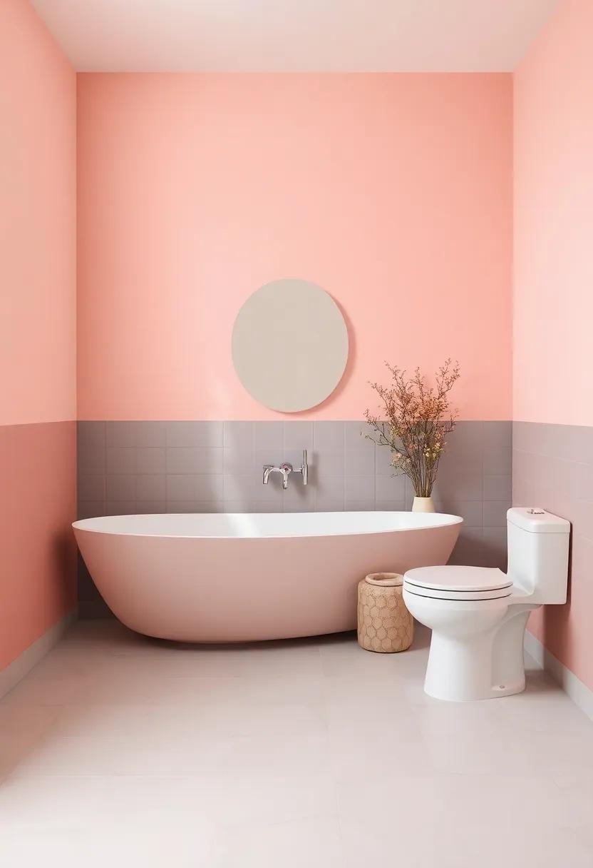
Focal Points in Color: Directing Attention to Key Bathroom Features
In any well-designed bathroom, certain elements naturally draw the eye and create a cohesive aesthetic. By strategically choosing paint colors, you can highlight key features that embody both functionality and style. Consider using a bold or contrasting shade to accentuate architectural details such as crown molding or a beautifully framed mirror. This approach can also apply to fixtures—painting the wall behind a freestanding tub in a soft pastel or a vibrant hue can create a stunning backdrop that enhances its allure.
Another effective method of guiding attention is through color layering. Employ a two-toned scheme where the lower half of the wall is a deeper shade, grounding the space while offering visual separation from lighter upper tones. This not only defines areas but also brings texture to your design. Pair these colors with decorative elements such as vintage tiles or quirky decor items to create a harmonious yet dynamic focal point.The interplay of light and shadow can further enhance features like a luxurious basin or designer shelving, making your bathroom as functional as it is indeed visually impactful.
Bathroom Color Schemes for Every Style: From Minimalist to Eclectic
When it comes to bathroom aesthetics, selecting the right color scheme can elevate your space from ordinary to extraordinary. For those who appreciate minimalism, soft neutrals such as pale grays, whites, and beiges create a serene atmosphere. Pair these colors with sleek fixtures and unembellished design to enhance the calming vibe. consider using pops of matte black or brushed nickel in your fixtures to add a touch of sophistication without overwhelming the simplicity of the design. On the other hand, if you find beauty in bold statements, consider vibrant hues like rich emerald green or deep navy blue, complemented by brass accents to create an eye-catching contrast.
For fans of eclectic design, the combination of multiple colors can reflect a dynamic personality. Think about using a mix of warm tones, such as terracotta or mustard yellow, blended with cool colors like teal or dusky rose. To help you visualize these combinations, examine the following table showcasing complementary color pairings that can bring your vision to life:
| Main Color | Complementary Accent Color |
|---|---|
| Soft Gray | Charcoal |
| Pale Blue | Coral |
| Ivory | Sage Green |
| Dark Plum | Gold |
Embrace the freedom to explore your personal style, whether you opt for a crisp, uncluttered look or a vibrant, layered aesthetic. Let your bathroom become a true reflection of who you are, where color does not just paint the walls but also tells a story of your unique taste and lifestyle.
The Role of Accessories: How Color Complements Your Bathroom Decor
when it comes to bathroom decor, accessories play a pivotal role in tying the space together. The beauty of color lies not only in the paint on the walls but also in the smaller elements that adorn the room. By thoughtfully selecting accessories that harmonize with your paint choice,you can enhance your bathroom’s overall aesthetic and create a cohesive look. Consider the following types of accessories:
- Towels: Choose shades that complement or contrast your wall color to add texture and visual interest.
- Rugs: A well-placed rug can provide warmth and additional color, grounding the overall decor.
- Shower curtains: Opt for patterns or solid colors that resonate with the hues in your paintwork.
- Artwork: Wall art in similar tones can bring life to your bathroom and serve as a focal point.
To illustrate how to mix and match colors effectively, here is a simple table showcasing some popular color combinations for accessory choices:
| Wall color | Accessory Color | Effect |
|---|---|---|
| Soft Blue | Coral | Creates a fresh and inviting contrast |
| Muted Gray | Bright Yellow | Adds a pop of fun and energy |
| Forest Green | Cream | Offers a calming and sophisticated touch |
| Pure White | Deep Navy | Creates a classic, nautical theme |
By understanding the synergy between your wall colors and accessory choices, you can use these elements to elevate your bathroom decor. Accessories allow for personal expression and versatility; they can be easily changed to keep your space feeling fresh and aligned with your style.
the world of bathroom paint colors is as vast and varied as your imagination.Whether you choose a tranquil blue to foster serenity or a vibrant yellow to ignite energy, the colors you select can redefine your space and elevate your mood. Remember, it’s not just about aesthetics; it’s about creating a sanctuary that reflects your personality and lifestyle. As you embark on your transformative journey, let your creativity flow and embrace the power of color to turn your bathroom into a chic oasis. With the tips and insights from this guide, you can confidently reimagine your space, turning each brushstroke into a step toward your perfect retreat.Happy painting!


